注意
跳至結尾下載完整的範例程式碼。或透過 Binder 在您的瀏覽器中執行此範例
探索 3D 影像(細胞)#
本教學是對三維影像處理的簡介。如需快速了解 3D 資料集,請參閱具有 3 個或更多空間維度的資料集。影像以 numpy 陣列表示。單通道或灰階影像是一個形狀為 (n_row, n_col) 的二維像素強度矩陣,其中 n_row(或 n_col)表示 列(或 欄)的數量。我們可以將 3D 體積建構為一系列 2D 平面,使 3D 影像的形狀為 (n_plane, n_row, n_col),其中 n_plane 是平面的數量。多通道或 RGB(A) 影像在最後位置有一個額外的 通道維度,其中包含色彩資訊。
這些慣例總結在下表中
影像類型 |
坐標 |
|---|---|
2D 灰階 |
|
2D 多通道 |
|
3D 灰階 |
|
3D 多通道 |
|
某些 3D 影像在每個維度中都以相同的解析度建構(例如,同步加速器斷層掃描或電腦產生的球體渲染)。但大多數實驗資料都是在三個維度中的一個維度中以較低的解析度擷取的,例如,拍攝薄片以將 3D 結構近似為 2D 影像堆疊。每個維度中像素之間的距離(稱為間距)被編碼為元組,並被某些 skimage 函數接受為參數,並可用於調整對濾波器的貢獻。
本教學中使用的資料由艾倫細胞科學研究所提供。它們在 列和 欄 維度中以 4 的因數進行降採樣,以減少其大小,進而減少計算時間。間距資訊由用於對細胞進行影像處理的顯微鏡報告。
import matplotlib.pyplot as plt
from mpl_toolkits.mplot3d.art3d import Poly3DCollection
import numpy as np

import plotly
import plotly.express as px
from skimage import exposure, util
from skimage.data import cells3d
載入和顯示 3D 影像#
data = util.img_as_float(cells3d()[:, 1, :, :])  # grab just the nuclei

print(f'shape: {data.shape}')
print(f'dtype: {data.dtype}')
print(f'range: ({data.min()}, {data.max()})')

# Report spacing from microscope
original_spacing = np.array([0.2900000, 0.0650000, 0.0650000])

# Account for downsampling of slices by 4
rescaled_spacing = original_spacing * [1, 4, 4]

# Normalize spacing so that pixels are a distance of 1 apart
spacing = rescaled_spacing / rescaled_spacing[2]

print(f'microscope spacing: {original_spacing}\n')
print(f'rescaled spacing: {rescaled_spacing} (after downsampling)\n')
print(f'normalized spacing: {spacing}\n')
shape: (60, 256, 256)
dtype: float64
range: (0.0, 1.0)
microscope spacing: [0.29  0.065 0.065]

rescaled spacing: [0.29 0.26 0.26] (after downsampling)

normalized spacing: [1.11538462 1.         1.        ]
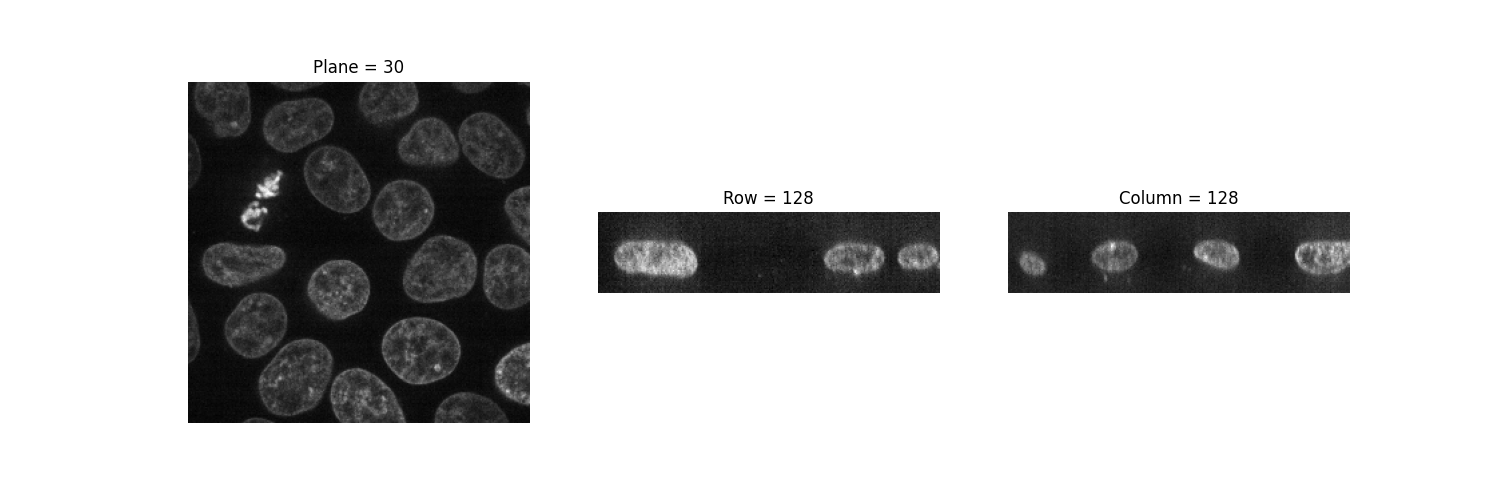
讓我們試著視覺化我們的 3D 影像。不幸的是,許多影像檢視器(例如 matplotlib 的 imshow)只能顯示 2D 資料。我們可以發現,當我們嘗試檢視 3D 資料時,它們會引發錯誤
Invalid shape (60, 256, 256) for image data
imshow 函數只能顯示灰階和 RGB(A) 2D 影像。因此,我們可以利用它來視覺化 2D 平面。通過固定一個軸,我們可以觀察影像的三種不同視圖。
def show_plane(ax, plane, cmap="gray", title=None):
    ax.imshow(plane, cmap=cmap)
    ax.set_axis_off()

    if title:
        ax.set_title(title)


(n_plane, n_row, n_col) = data.shape
_, (a, b, c) = plt.subplots(ncols=3, figsize=(15, 5))

show_plane(a, data[n_plane // 2], title=f'Plane = {n_plane // 2}')
show_plane(b, data[:, n_row // 2, :], title=f'Row = {n_row // 2}')
show_plane(c, data[:, :, n_col // 2], title=f'Column = {n_col // 2}')
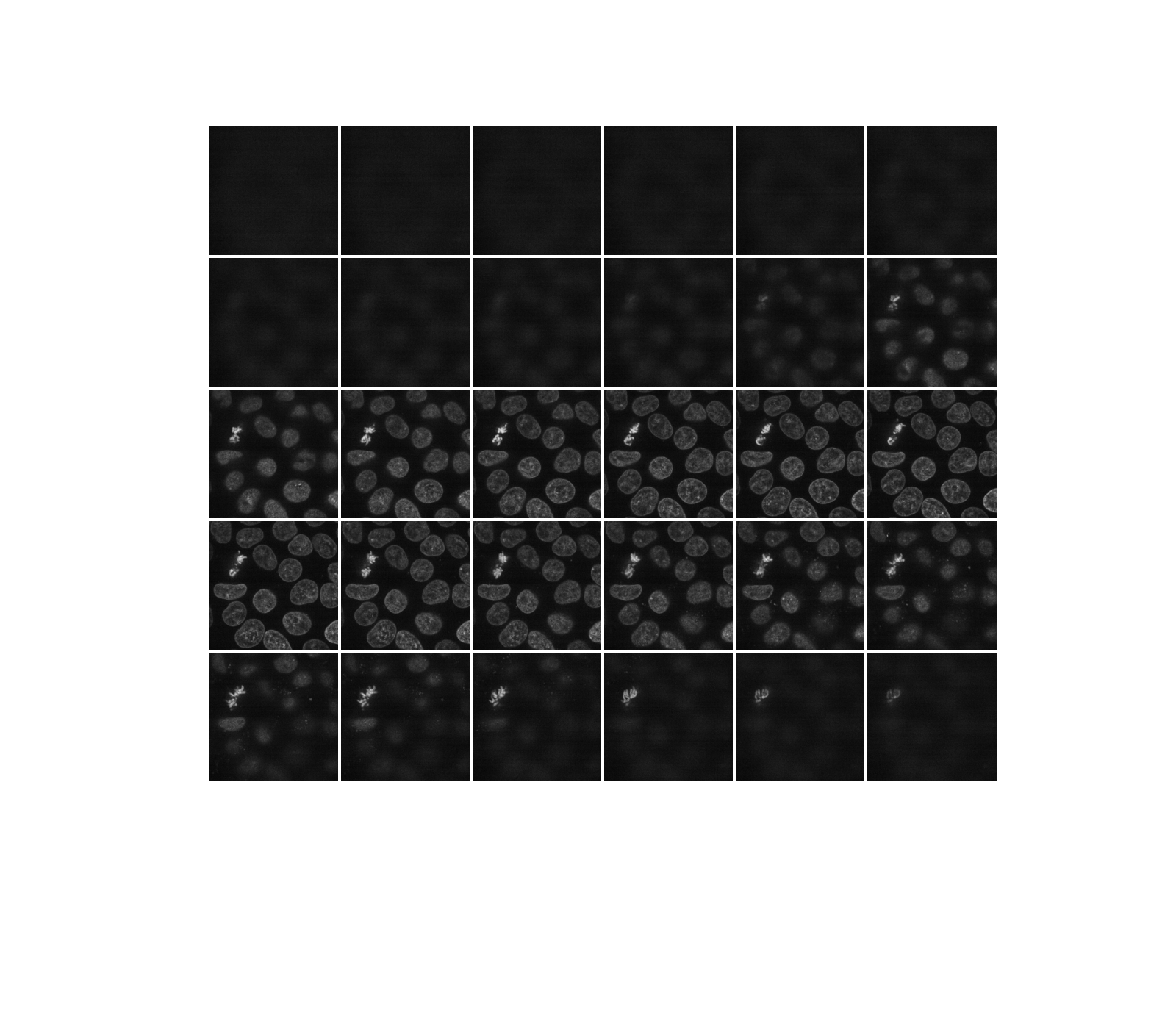
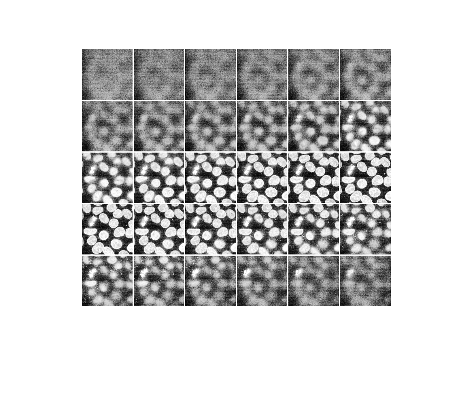
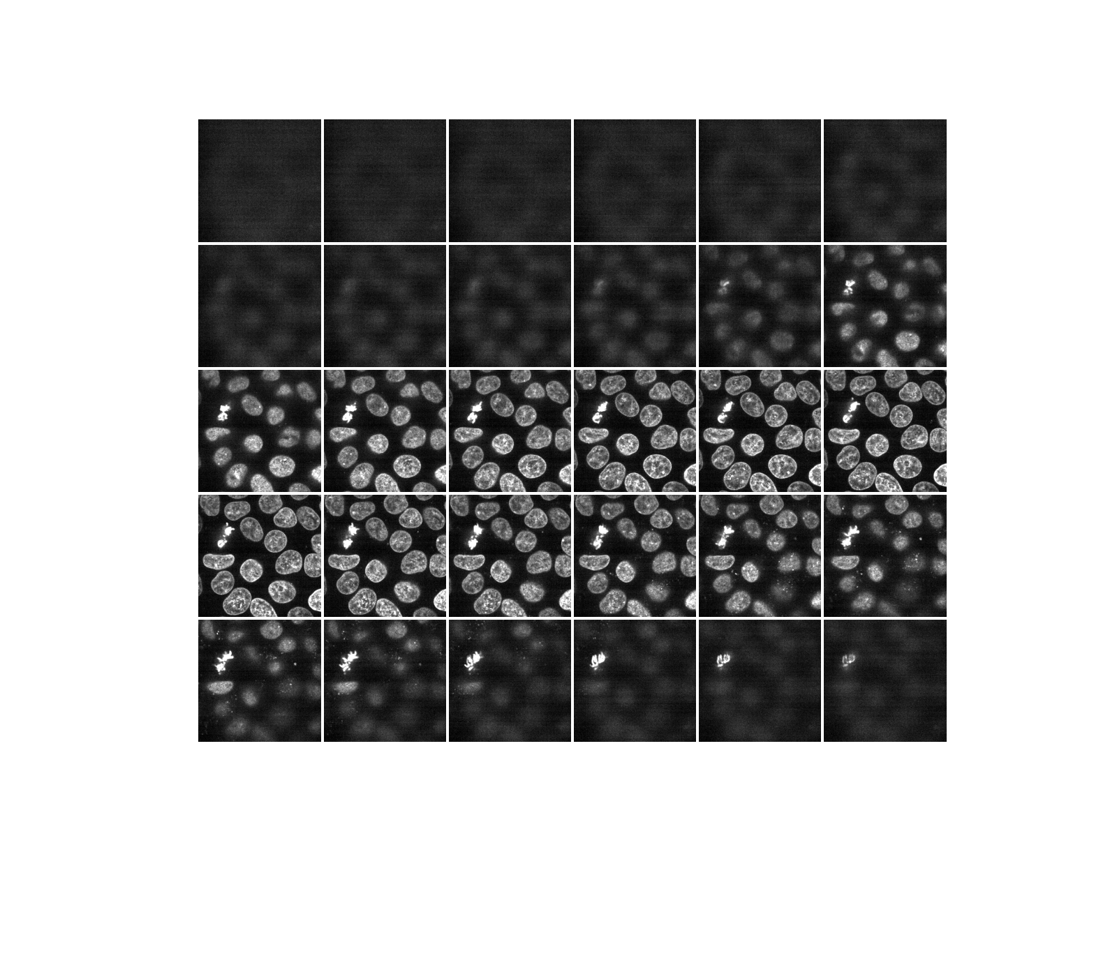
如前所述,三維影像可以看作是一系列的二維平面。讓我們編寫一個輔助函數 display,以建立多個平面的蒙太奇。預設情況下,會顯示每隔一個平面。
def display(im3d, cmap='gray', step=2):
    data_montage = util.montage(im3d[::step], padding_width=4, fill=np.nan)
    _, ax = plt.subplots(figsize=(16, 14))
    ax.imshow(data_montage, cmap=cmap)
    ax.set_axis_off()


display(data)
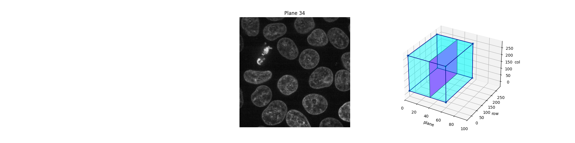
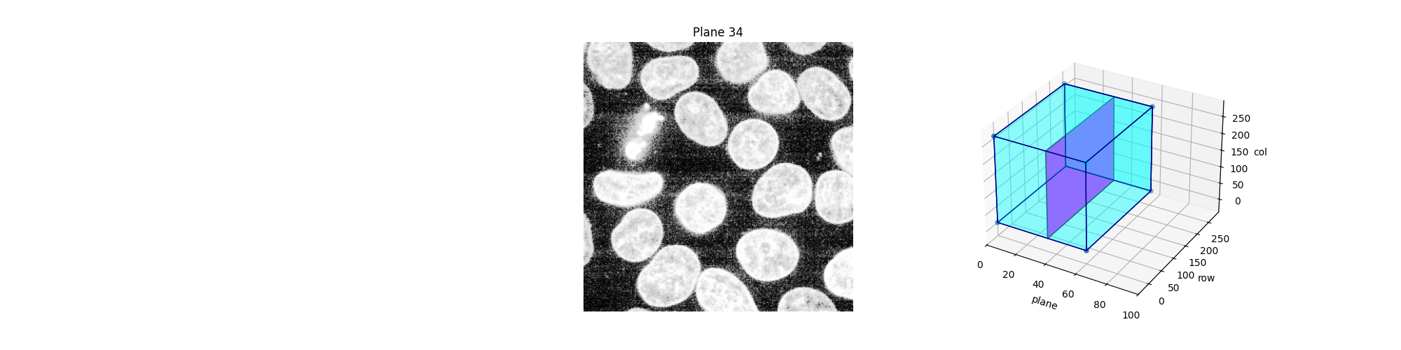
或者,我們可以利用 Jupyter 小工具來互動式地瀏覽這些平面(切片)。讓使用者選擇要顯示哪個切片,並顯示此切片在 3D 資料集中的位置。請注意,在靜態 HTML 頁面中,您無法看到 Jupyter 小工具的作用,就像此範例的線上版本一樣。要讓以下程式碼運作,您需要一個正在執行的 Jupyter 核心,無論是在本機還是在雲端:請參閱此頁面底部,以下載 Jupyter 筆記本並在您的電腦上執行,或直接在 Binder 中開啟。除了運作中的核心之外,您還需要一個網頁瀏覽器:在純 Python 中執行程式碼也不會起作用。
def slice_in_3D(ax, i):
    # From https://stackoverflow.com/questions/44881885/python-draw-3d-cube
    Z = np.array(
        [
            [0, 0, 0],
            [1, 0, 0],
            [1, 1, 0],
            [0, 1, 0],
            [0, 0, 1],
            [1, 0, 1],
            [1, 1, 1],
            [0, 1, 1],
        ]
    )

    Z = Z * data.shape
    r = [-1, 1]
    X, Y = np.meshgrid(r, r)

    # Plot vertices
    ax.scatter3D(Z[:, 0], Z[:, 1], Z[:, 2])

    # List sides' polygons of figure
    verts = [
        [Z[0], Z[1], Z[2], Z[3]],
        [Z[4], Z[5], Z[6], Z[7]],
        [Z[0], Z[1], Z[5], Z[4]],
        [Z[2], Z[3], Z[7], Z[6]],
        [Z[1], Z[2], Z[6], Z[5]],
        [Z[4], Z[7], Z[3], Z[0]],
        [Z[2], Z[3], Z[7], Z[6]],
    ]

    # Plot sides
    ax.add_collection3d(
        Poly3DCollection(
            verts, facecolors=(0, 1, 1, 0.25), linewidths=1, edgecolors="darkblue"
        )
    )

    verts = np.array([[[0, 0, 0], [0, 0, 1], [0, 1, 1], [0, 1, 0]]])
    verts = verts * (60, 256, 256)
    verts += [i, 0, 0]

    ax.add_collection3d(
        Poly3DCollection(verts, facecolors="magenta", linewidths=1, edgecolors="black")
    )

    ax.set_xlabel("plane")
    ax.set_xlim(0, 100)
    ax.set_ylabel("row")
    ax.set_zlabel("col")

    # Autoscale plot axes
    scaling = np.array([getattr(ax, f'get_{dim}lim')() for dim in "xyz"])
    ax.auto_scale_xyz(*[[np.min(scaling), np.max(scaling)]] * 3)


def explore_slices(data, cmap="gray"):
    from ipywidgets import interact

    N = len(data)

    @interact(plane=(0, N - 1))
    def display_slice(plane=34):
        fig, ax = plt.subplots(figsize=(20, 5))

        ax_3D = fig.add_subplot(133, projection="3d")

        show_plane(ax, data[plane], title=f'Plane {plane}', cmap=cmap)
        slice_in_3D(ax_3D, plane)

        plt.show()

    return display_slice


explore_slices(data)
interactive(children=(IntSlider(value=34, description='plane', max=59), Output()), _dom_classes=('widget-interact',))

<function explore_slices.<locals>.display_slice at 0x7f287ebaa020>
調整曝光#
Scikit-image 的 exposure 模組包含許多用於調整影像對比度的函數。這些函數操作像素值。通常,不需要考慮影像的維度或像素間距。但是,在局部曝光校正中,可能需要調整窗口大小,以確保沿每個軸的實際座標大小相等。
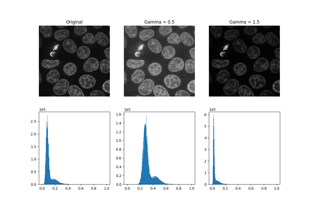
伽瑪校正會使影像變亮或變暗。將冪律轉換(其中 gamma 表示冪律指數)應用於影像中的每個像素:gamma < 1 會使影像變亮,而 gamma > 1 則會使影像變暗。
def plot_hist(ax, data, title=None):
    # Helper function for plotting histograms
    ax.hist(data.ravel(), bins=256)
    ax.ticklabel_format(axis="y", style="scientific", scilimits=(0, 0))

    if title:
        ax.set_title(title)


gamma_low_val = 0.5
gamma_low = exposure.adjust_gamma(data, gamma=gamma_low_val)

gamma_high_val = 1.5
gamma_high = exposure.adjust_gamma(data, gamma=gamma_high_val)

_, ((a, b, c), (d, e, f)) = plt.subplots(nrows=2, ncols=3, figsize=(12, 8))

show_plane(a, data[32], title='Original')
show_plane(b, gamma_low[32], title=f'Gamma = {gamma_low_val}')
show_plane(c, gamma_high[32], title=f'Gamma = {gamma_high_val}')

plot_hist(d, data)
plot_hist(e, gamma_low)
plot_hist(f, gamma_high)
直方圖均衡化藉由重新分配像素強度來改善影像的對比度。最常見的像素強度會被分散開來,從而增加低對比度區域的對比度。此方法的一個缺點是它可能會增強背景雜訊。
equalized_data = exposure.equalize_hist(data)

display(equalized_data)
和以前一樣,如果我們有一個正在運行的 Jupyter 核心,我們可以互動式地瀏覽上面的切片。
explore_slices(equalized_data)
interactive(children=(IntSlider(value=34, description='plane', max=59), Output()), _dom_classes=('widget-interact',))

<function explore_slices.<locals>.display_slice at 0x7f287efc22a0>
現在讓我們繪製直方圖均衡化前後的影像直方圖。下面,我們繪製各自的累積分布函數 (CDF)。
_, ((a, b), (c, d)) = plt.subplots(nrows=2, ncols=2, figsize=(16, 8))

plot_hist(a, data, title="Original histogram")
plot_hist(b, equalized_data, title="Equalized histogram")

cdf, bins = exposure.cumulative_distribution(data.ravel())
c.plot(bins, cdf, "r")
c.set_title("Original CDF")

cdf, bins = exposure.cumulative_distribution(equalized_data.ravel())
d.plot(bins, cdf, "r")
d.set_title("Histogram equalization CDF")
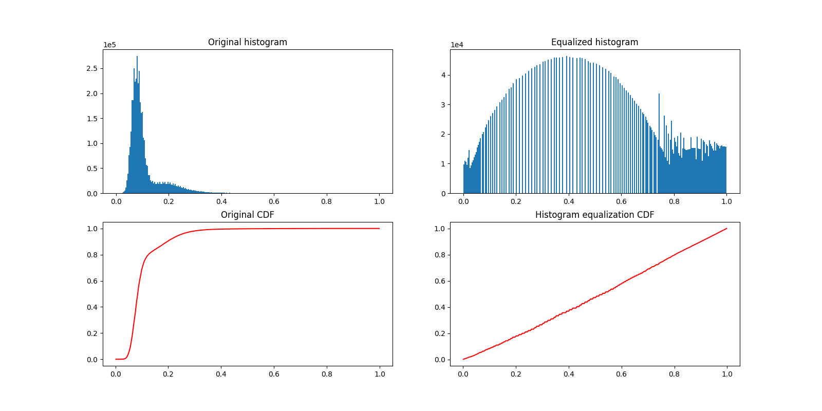
Text(0.5, 1.0, 'Histogram equalization CDF')
大多數實驗影像都會受到椒鹽雜訊的影響。一些明亮的偽影會降低感興趣像素的相對強度。一種提高對比度的簡單方法是將像素值裁剪到最低和最高極端值。裁剪最暗和最亮的 0.5% 像素將會增加影像的整體對比度。
vmin, vmax = np.percentile(data, q=(0.5, 99.5))

clipped_data = exposure.rescale_intensity(
    data, in_range=(vmin, vmax), out_range=np.float32
)

display(clipped_data)
或者,我們可以利用 Plotly Express 來互動式地瀏覽這些平面(切片)。請注意,這在靜態 HTML 頁面中也能運作!
fig = px.imshow(data, animation_frame=0, binary_string=True)
fig.update_xaxes(showticklabels=False)
fig.update_yaxes(showticklabels=False)
fig.update_layout(autosize=False, width=500, height=500, coloraxis_showscale=False)
# Drop animation buttons
fig['layout'].pop('updatemenus')
plotly.io.show(fig)

plt.show()
腳本總執行時間: (0 分鐘 10.688 秒)